

Appearance
Appearance sets how GearConnect looks: the panes, dialogs, menus, toolbars and cards, along with the drawing canvas behind them. You pick it on the Preferences tab of the User Settings Dialog, or from the Choose Your Style Dialog.
Appearance and Theme BETA APP
Section titled “Appearance and Theme ”Appearance and Theme are two separate settings. Each appearance comes in both a light and a dark version, so you pick a theme (Automatic, Light or Dark) and an appearance independently of each other.
Your choice is saved to your account, so it follows you between devices and sessions.
The Appearances BETA APP
Section titled “The Appearances ”The glass appearances are see-through, so your drawing shows behind panes, menus and dialogs:
- Neon: Panes, menus and dialogs look like coloured frosted glass.
- Glass: The same frosted glass in neutral tones.
- Frost: A cloudier glass, so less of your drawing shows through.
The flat appearances are solid, with no glass effect:
- Flat: Panes, menus, dialogs and gear are plain, solid colours.
- Slate: The same solid look in shades of grey, with colour kept for buttons and controls.
- Draft: A high-contrast look like a drawing sheet, with thin lines between panels and gear headers in one solid colour, resembling a CAD program.
Choose Your Style BETA APP
Section titled “Choose Your Style ”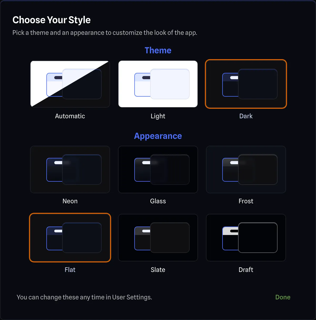
The Choose Your Style Dialog shows a preview card for each Theme (Automatic, Light and Dark) and each Appearance.
Ways to Access BETA APP
Section titled “Ways to Access ”There are two ways to open the dialog:
- It opens by itself the first time you open a project on an account with no appearance saved.
- Click the Style Picker button on the Preferences tab of User Settings.
On the Drawing Canvas BETA APP
Section titled “On the Drawing Canvas ”The colour behind the drawing, the colour of the grid, and the colour of gear with no colour of its own all come from the active appearance.
- The glass appearances give that gear a softly shaded body and a header that fades across it.
- The flat appearances give it a plain body and a plain header, with no shading.
Gear that has its own colour, or takes its colour from its layer, keeps that colour under every appearance.
On Detail Mode gear with Expansion Groups on, the boxes around each expansion card group follow the appearance too: shaded in the glass appearances and plain in the flat ones. On gear set to Header + Body they take the gear’s colour instead. See Gear Colour Style.
Exports BETA APP
Section titled “Exports ”Exports use the appearance you work in, through Follow App on the Appearance row of the Export Settings Pane. Pick a specific appearance there to export with a different one. The theme is set there separately, so an export can be light while you work in dark. See Exporting for the export formats.
Reduced Animation BETA APP
Section titled “Reduced Animation ”Reduced Animation, on the Preferences tab of User Settings, reduces the visual animations throughout the application. That includes the Save Status, described on the Save Status page, which stays still while your work saves.